(“Clinic For The Soul”)
About the brand
Luisa García started this clinic shortly after graduating as a logotherapist and thanatologist in Guatemala City, Guatemala. (Thanatology is the “study of the phenomena of death and of psychological mechanisms for coping with them”). She felt called to learn how to help others deal with grief and to provide counseling and support. After graduating and choosing a name that she liked, she asked me to design her brand and social media image.
The purpose of this clinic is to help people who feel like their lifes no longer have any purpose, who are dealing with grief or loss of identity, or might be going through some type of intense medical treatment. She wants to create a space where people feel safe, seen and heard. A place where they’re not just told “it’s going to be okay”, but where they can feel real support in a battle that can feel extremely isolating.
This is the entire process of bringing this to life.
The Colors
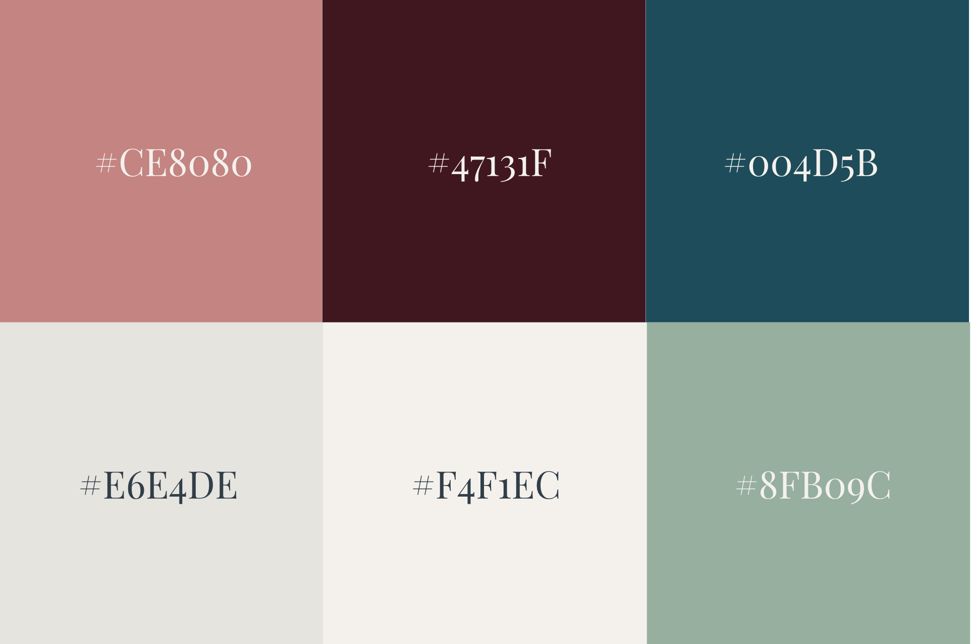
When I work on branding, I ask my clients to give me 4-5 words that they would use to describe their business. The words Luisa gave me were hope, rebirth, spirituality, connection, and support. After playing with some color palette options, we felt that this one reflected the words well and also provided a solid base for creativity and impact.
While these colors are used separately for different items and for hierarchy, I also created the gradient you can see in the title section above as a background for banners, logos, and social media. I felt that a gradient could transmit some of the softness and approachability I was trying to show in this brand.
The Logo Options
After that, I moved on to logo options. Her only ask was that she wanted a serif font, and she liked the idea of implementing a moon or stars into the logo.
From the first 6 options, she selected number 2, but wanted to try it out with the moon and star in number 4. I sent over 4 more options (bottom four), and our *almost* final version was the first one.
Final Logos
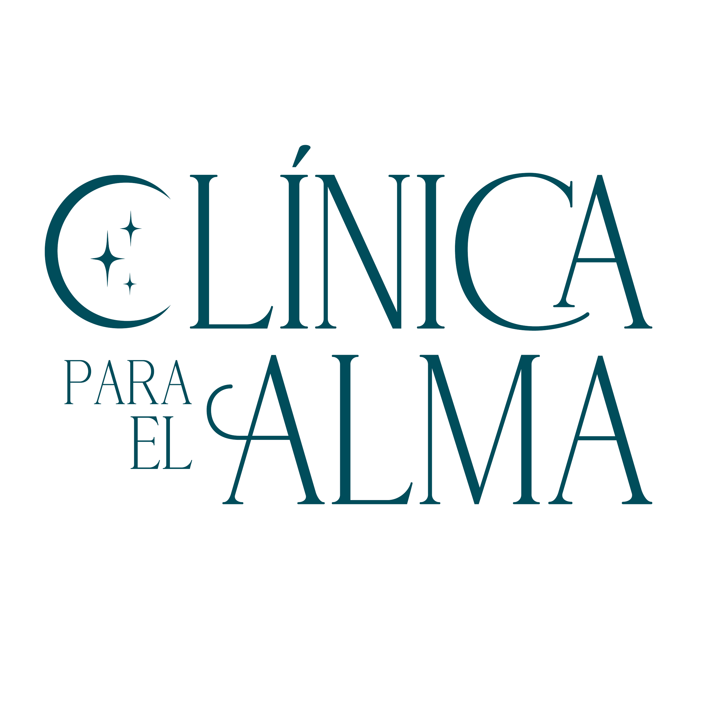
This was the final look for our primary and secondary logos, plus our main icon.
Designed around the symbol of a new moon and stars, these logos represent rebirth, transformation, and fresh beginnings: a gentle, hopeful visual identity for this thanatology practice.
Primary Logo

Secondary Logo/
Main Icon

Secondary Icon
The Font
Luisa García started this clinic shortly after graduating as a logotherapist and thanatologist in Guatemala City, Guatemala. (Thanatology is the “study of the phenomena of death and of psychological mechanisms for coping with them”). She felt called to learn how to help others deal with grief and to provide counseling and support. After graduating and choosing a name that she liked, she asked me to design her brand and social media image.
The purpose of this clinic is to help people who feel like their lifes no longer have any purpose, who are dealing with grief or loss of identity, or might be going through some type of intense medical treatment. She wants to create a space where people feel safe, seen and heard. A place where they’re not just told “it’s going to be okay”, but where they can feel real support in a battle that can feel extremely isolating.
This is the entire process of bringing this to life.
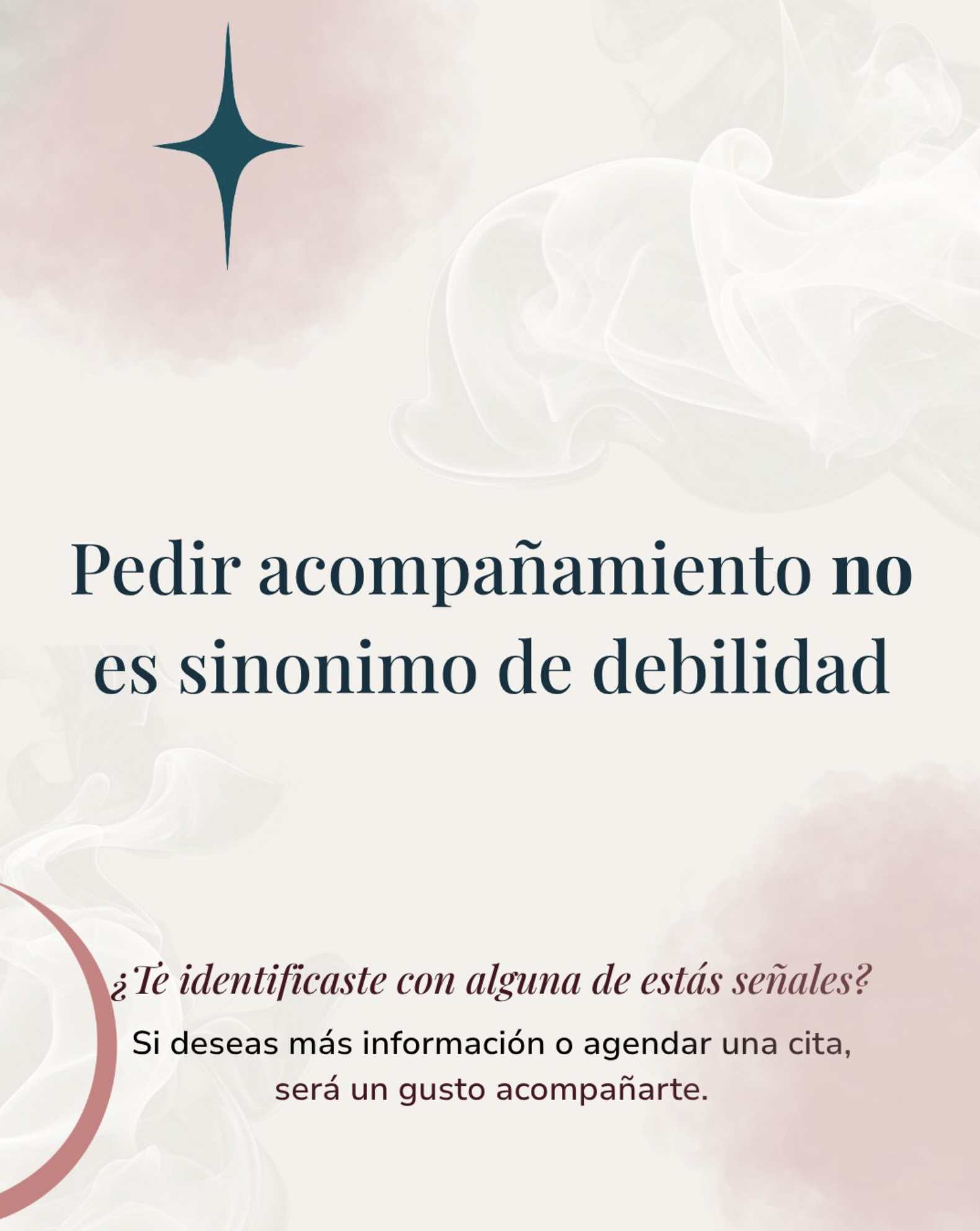
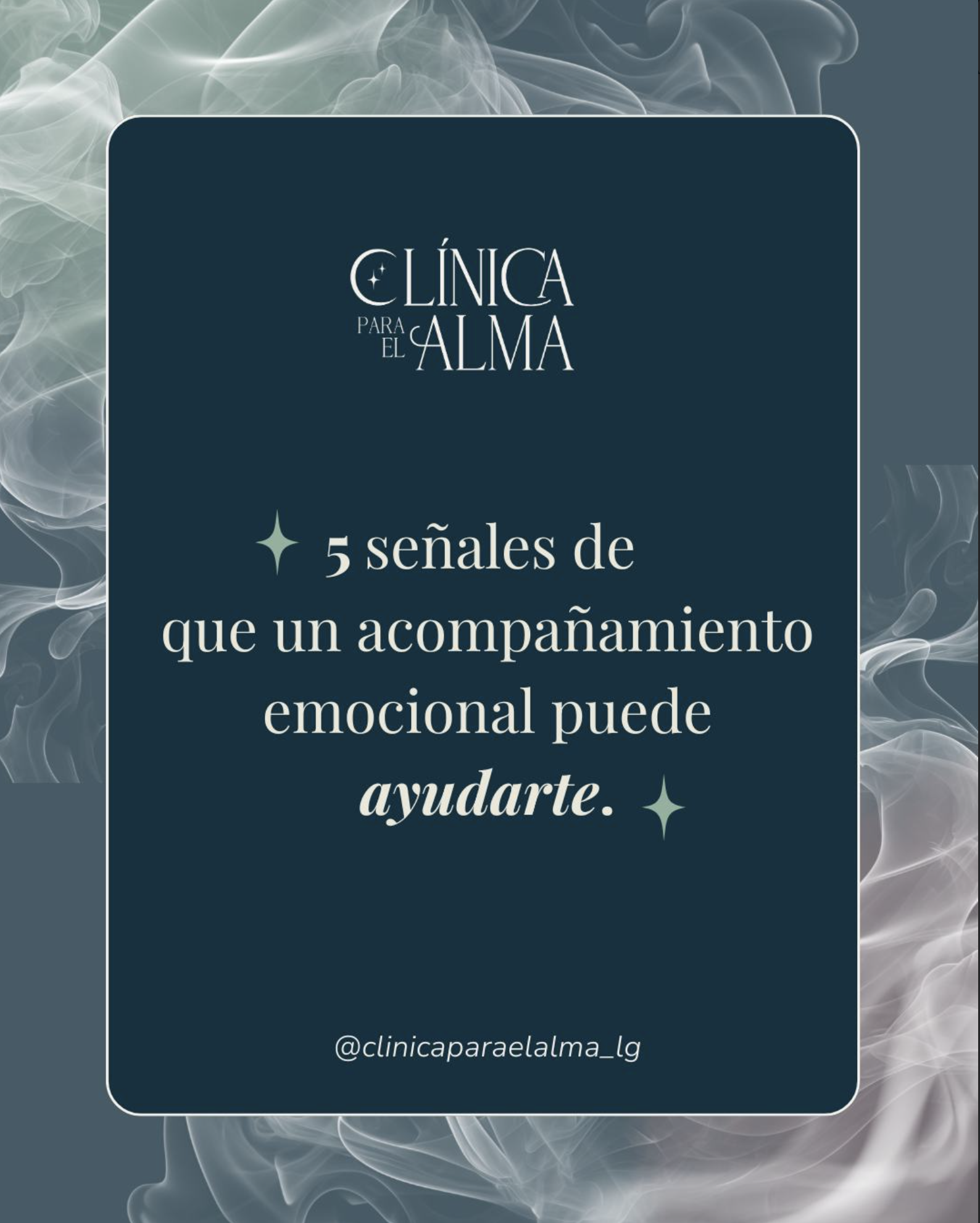
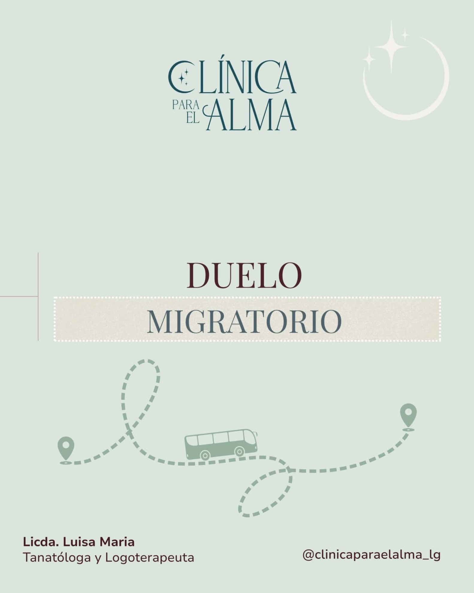
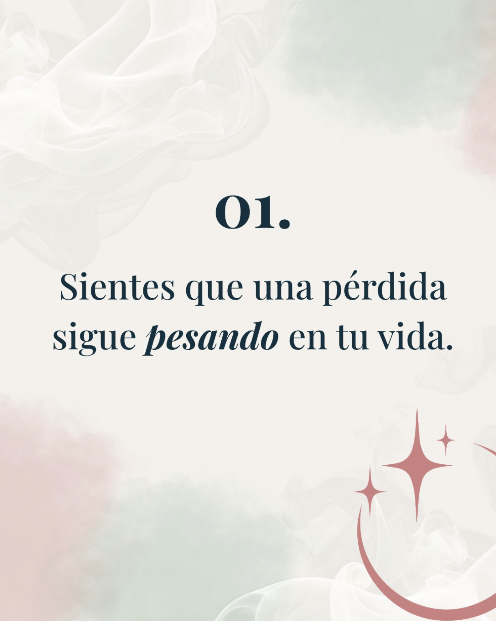
The brand in action:
This is how the brand visuals I created are being used in social media posts by Luisa and her social media manager: